
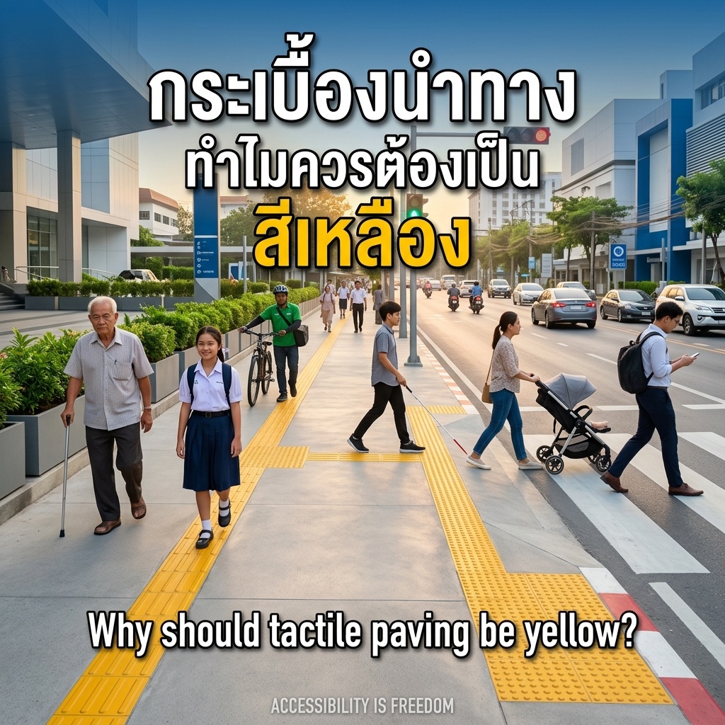
I’m glad tactile paving is now a standard feature of sidewalks. But I still see blind spots from design to construction. Let’s talk about yellow tactile paving.
ISO 23599 only requires visual contrast — no color mandated. Japan’s🇯🇵 JIS T 9251 controls shape and luminance only. Japanese guidelines require luminance ratio ≥2.0 and brightness difference ≥5, and built examples around Japan use a variety of colors.
Thailand🇹🇭: ministerial regulations (2005, 2021) only say tactile paving must differ in texture AND color — yellow is never named.
So why start with yellow?
1️⃣ Yellow is the traffic warning color. Under ISO 3864-1 and TIS 542-2549, the whole country reads yellow as a warning — the brain responds instantly.
2️⃣ Yellow contrasts most with gray concrete — luminance jumps highest. It stays visible for people with red-green color blindness (~8% of men), most of whom still see yellow and blue clearly. WHO: ~2.2 billion people have some vision impairment.
3️⃣ Most important: we wrongly think tactile paving is only for people who are blind. Children, older adults, people carrying bags, people staring at phones — we all use it without noticing. It helps everyone — the heart of Universal Design. Like the ramp built for wheelchair users, yet everyone wheels their loads up and down it every day. That’s the inclusive city. If every city uses the same yellow tactile paving, familiarity means the brain doesn’t have to re-interpret the signal — everyone finds exits faster in emergencies.
Anything weak, we rebuild better — a new standard.
Join hands and choose yellow as our standard — a city where everyone travels with confidence, safety, and equality.
Sources: ISO 23599, JIS T 9251, Thai regs 2005/2021, ISO 3864-1, TIS 542-2549, WHO